Friday, September 28, 2012

I Can't Think of a Better Title than "The Secret Chatter of Golden Monkeys"


This editorial, entitled "The Secret Chatter of Golden Monkeys" is bright, beautiful, and fun. The clothes are very modern and bright, but instead of clashing with the traditional Chinese botanical garden they work in the environment extremely well and create a nice editorial. The production in these shots is great; the lighting is simple and the use of Photoshop seems to be limited. All three of these images just work for me. I absolutely love the movement of the red fabric in the first picture. It creates a lovely shape and draws the eye to the center of the image for the viewer to admire both the main model and the two supporting girls in the pagoda. The setting in that picture is gorgeous and the shot makes me want to visit this garden. The second photograph employs great use of color, with the purple in the hat reflecte in the flowers and the orange in the hat matching the fur of the monkeys. I'm sure it wasn't easy to capture this shot, and hopefully no feces was thrown by the animals, but the model looks strong and confident, and once again the traditional Asian scenery is combined with a modern look. That motif carries into the third image as well, and the entire scene is elegant and serene. I love how the model's hair almost resembles the fins on the top of a koy fish, and she is doing a great job of selling the shoes and jewelry. The pond is a simple but beautiful backdrop, and the angle and cropping of this photo really adds to its overall effect. This editorial is not overproduced or elaborate, just simply beautiful.

Wednesday, September 26, 2012

Too Cool for School


I'm guessing it was intentional to make these photos appear like they've been through an Instagram filter, because that just adds to the young, hip feeling this campaign from DSquared is going for. I think the photo effects are just a little too extreme, if they had maybe published them a few clicks earlier they would have been perfect. It does, however, recall an image that could be seen on an old school slide projector. The setting for the shoot is really great; the typical boring high school classroom that everyone has been in and dreamt of escaping is a great background for these teenagers that are too cool to be there. The attitude exuding from the models is palpable and perfect for the brand. Fashion ads are all about aspiration, and I want to be one of the kids in this campaign...except I couldn't afford a single thing they're wearing...and they'd probably think I'm lame. They're loss. 


Tuesday, September 25, 2012

So This is Where the Wild Things Are


Mulberry's newest campaign is brilliant. Calling upon imagery from the book and movie "Where the Wild Things Are," it creates beautiful, whimsical images and truly transports the viewer to another world. I would love to know how the monsters in the photos were created; if they were borrowed costumes from the movie set, or if they had to be recreated just for this shoot. Either way, they look fantastic, and the model does such a good job of interacting with them. It was a brilliant move to keep the faces of the monsters mostly hidden, to maintain that aura of mystery and not take away focus from the model or clothes. Almost everyone gets the ad's reference, so it's unnecessary to explicitly show the wild things. I think the third image is my favorite of the set, because the clothing works so well with the theme of the campaign, and the model's pose is animalistic, just like the monsters behind her. The second image is also beautiful, and I feel the girl's innocence and fear in the picture. The setting for the photos is perfect, capturing the essence of fall/winter. This shoot brings me back to my childhood so I immediately have a connection to it, and the beautiful photography and art direction only make me love it more. 


Whatever's Happening...I Like It


There's a lot going on in this editorial: wild clothes, crazy makeup, and a lot of editing...and what could have turned into a gigantic train wreck produced some amazing images. Karlie Kloss deserves a ton of credit here, as she is the only model featured in the editorial but puts on so many different faces and poses that it sometimes feels like a completely different girl. The art direction in these shots is stunning. It's whimsical and almost reminds me of a children's book. My favorite image is the second, and I'm still trying to figure out how that picture was made. At first glance it appears as a watercolor illustration, but the model really did pose for this. The juxtaposition between the light pink background and the dark, grim tree with girls stuck on it is beautiful. The first image also has this whimsy, with the elongation of Karlie on the left, and I love her expression in the carriage. Once again I'm trying to guess how this shot was ultimately composed; the ground looks painted, I'm trying to figure out if the sky is real or not, but the final photo is fantastic. The final picture could be used as a classic circus or ballet advertisement, and I love the pastel color palette. The third photo is another fantastic combination of bight and dark imagery, with the beautiful rose petals and tea party surrounded by dying, withering trees. This editorial is definitely out there, but in the best way possible. 

Thursday, September 20, 2012

Shield Your Eyes


So there's a lot going on here, which is not necessarily a bad thing. The reason I'm not wild about this spread is the models, not the seizure inducing backgrounds. I think if the background is loud and crazy, the models should be doing so much more than standing there looking bored. There's no life in any of the photos from the models, which is a shame because the cloth in the back is so full of life. If I had been on set, I would have the models do exaggerated poses and faces, just to add to the fun of the editorial. They're not interacting with the backgrounds in any way, they're not interacting with the photographer in any way...it's all just boring. The set can't do all the work! If you want an insane patterned backdrop, then dress the models in insane clashing prints, it makes sense for them to act insane too. It's a shame this crazy and colorful setting ended up producing dull pictures. 


Sunday, September 9, 2012

Run for Covers

Vogue Italia is considered to be one of the most respected fashion magazines in the entire world. It is know to push the limits of fashion, and its roster of photographers include some the best in the industry today. I knew I'd be able to find some amazing images by searching through their archives, and decided to highlight a few of my favorite covers from the renown publication. 


This one instantly caught my eye because it expertly mixes a variety of patterns and textures in the background to create a stunning backdrop for the model. Her dress blends in perfectly, and her pose is great: strong and confident. Her dress may fade into the background, but she certainly does not. I also love the type treatment for this cover. Giving the title of the magazine itself a pattern adds so much to the overall image. It's not necessarily what I think of when I hear "First Look at Spring," which makes it even better. 


This cover is one of my favorites because of its humor and the story it tells. I love the air of superiority and grandeur the plastic surgery victim gives off, and the lighting is truly beautiful. The maid is giving just as much attitude as the model herself, and the overall absurdity of the image is fantastic. 


Composition is what makes this such a stunning image. The photographer's decision to have the girls coming from the side of the cover is great. The lighting bounces off the leather beautifully, and although the background is simple and gray, it works to highlight the two models. I also love the small detail of the top model's eye caught in the middle of the "O" in Vogue. The model's really shine in this cover and helped produce a very stunning photo. 


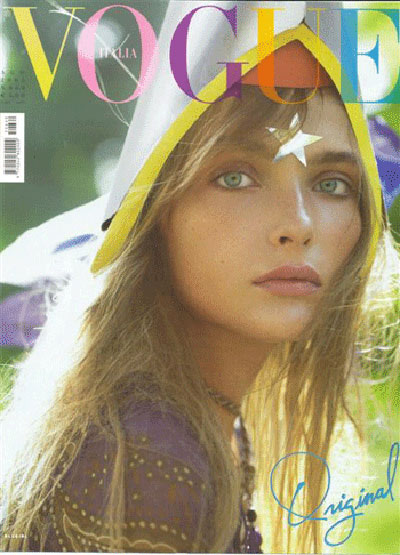
Bright, light, and colorful, this cover is very different from the others. It calls back to the 1970s with both the colors for the headline and the filter used in the photo. The model stares straight to camera, looking hopeful and innocent, and I can almost feel her vulnerability. This is a simple cover, but I still love it for that very reason. 


Thursday, September 6, 2012


These striking photos are from Louis Vuitton's new advertising campaign, and I commend them on taking such a huge step away from their stuffy, luxurious norm to do something more fun and interesting. This campaign is cool and exciting, and the final images are really striking. The background isn't too elaborate, it's simply a two-toned polka dot set, but combined with the clothing and the attitude coming from the model, this is a great fashion campaign. The first image is so much fun, and I love the pose and expression on the model's face. In the second photograph she comes across more fierce and confident, which I'm not sure works. In the third and fourth photos the model goes back to being carefree and cool, and those work more for me as a whole. The polkadot motif obviously jumps from the clothes to the backdrop, and it works seamlessly. It could very easily become garish and terrible, but  the art direction is perfect and creates a great, cohesive campaign.